• Available for Full-Time Job

Inside Out

Branding / Identity, Print Collateral

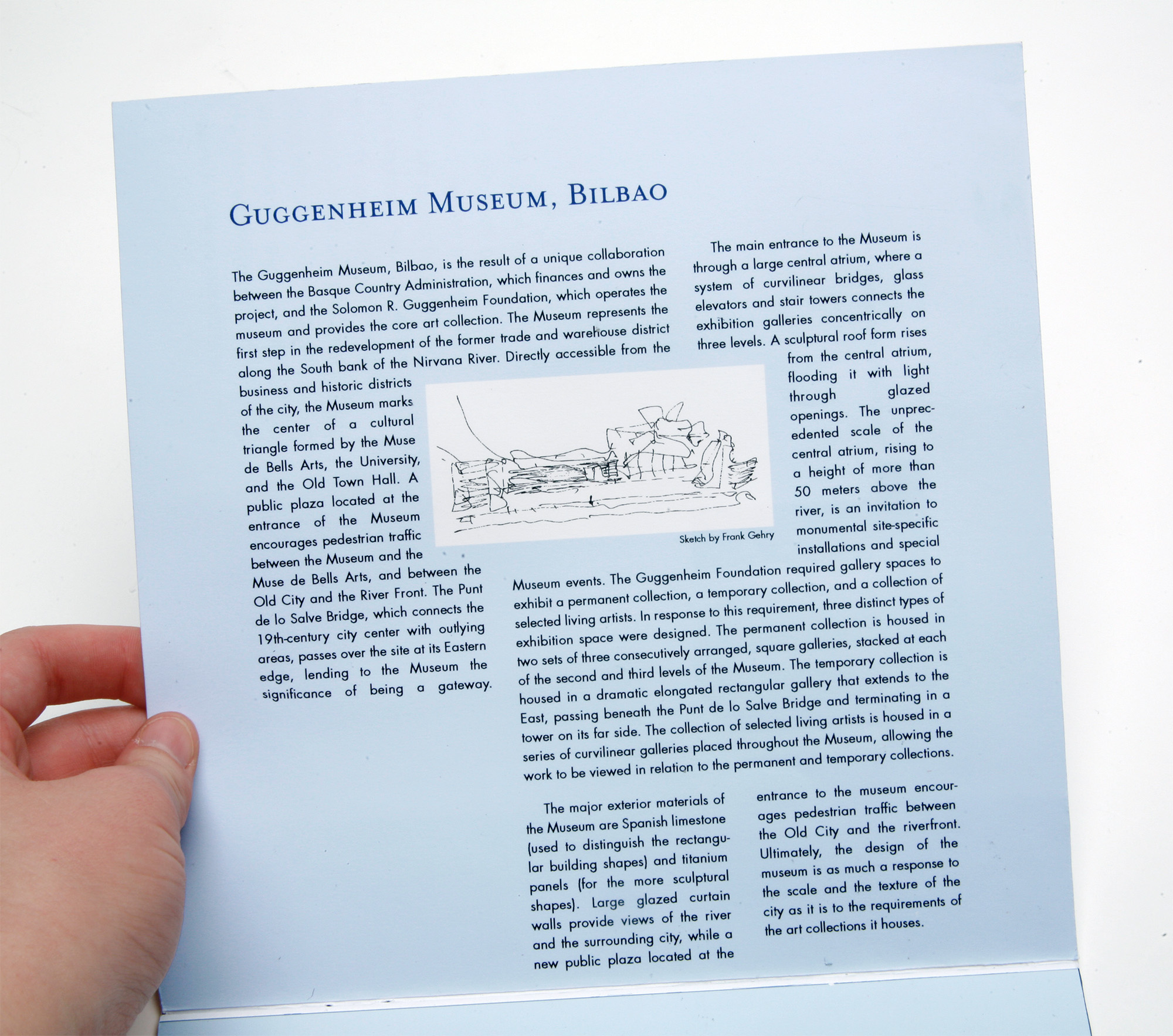
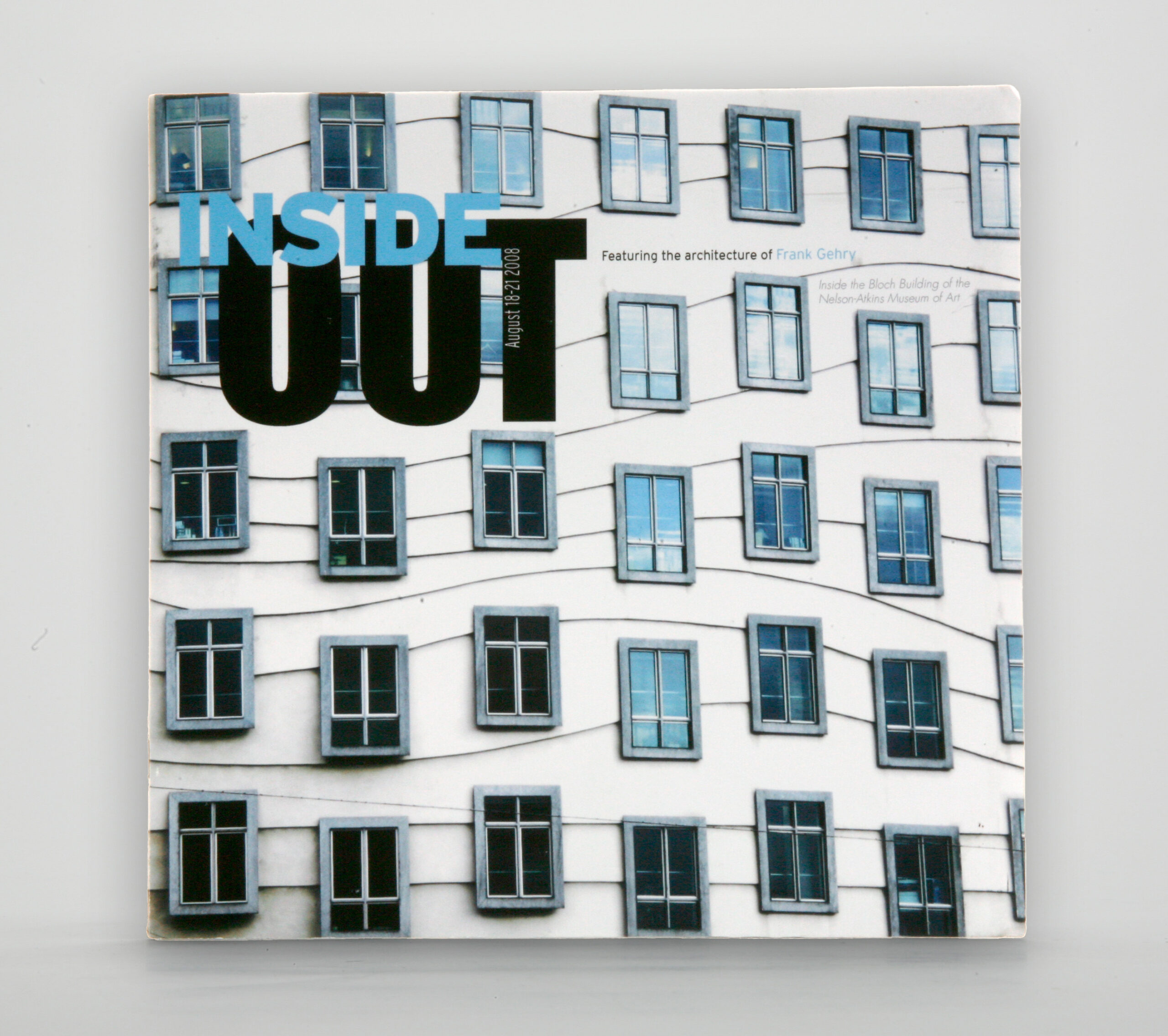
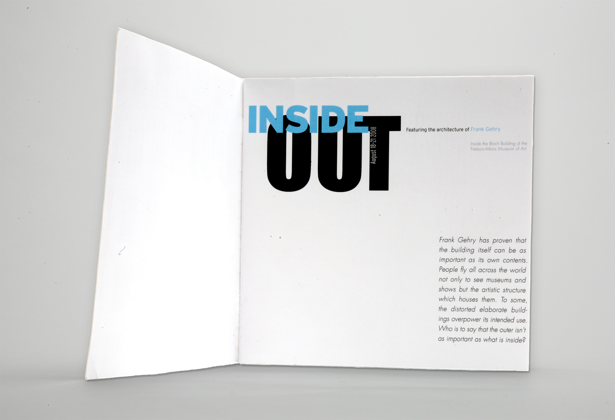
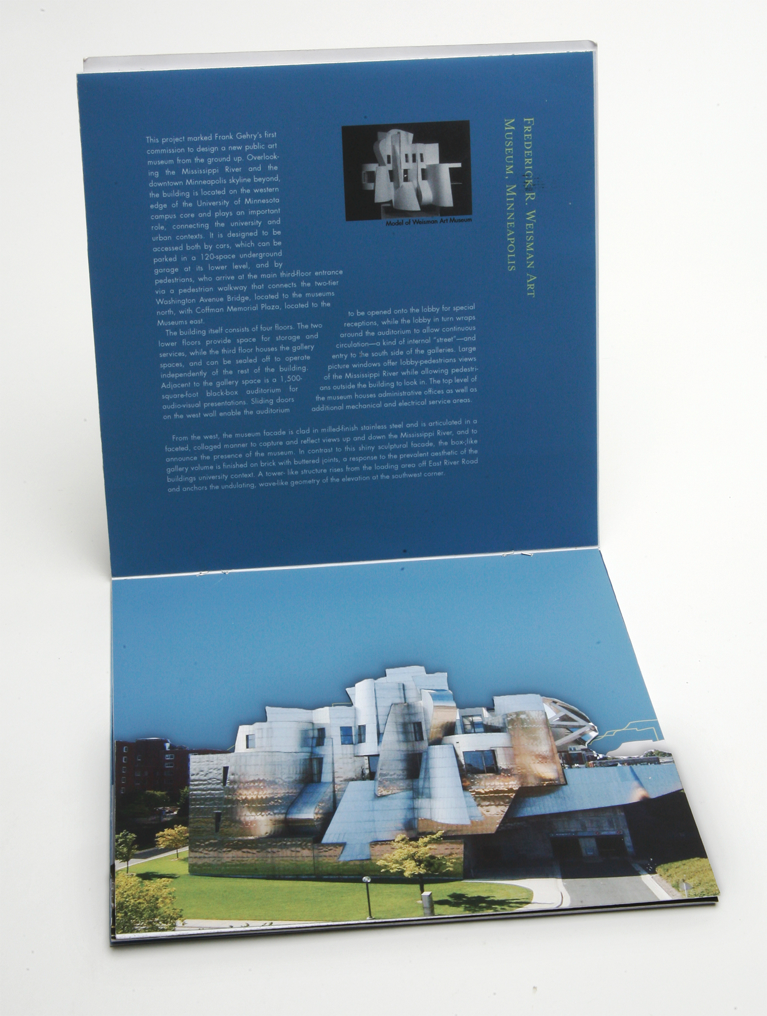
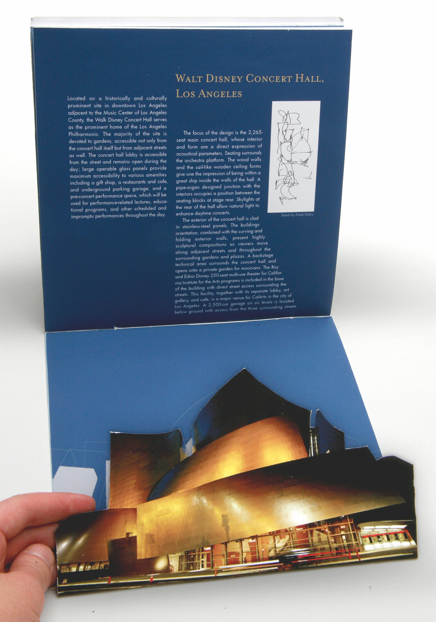
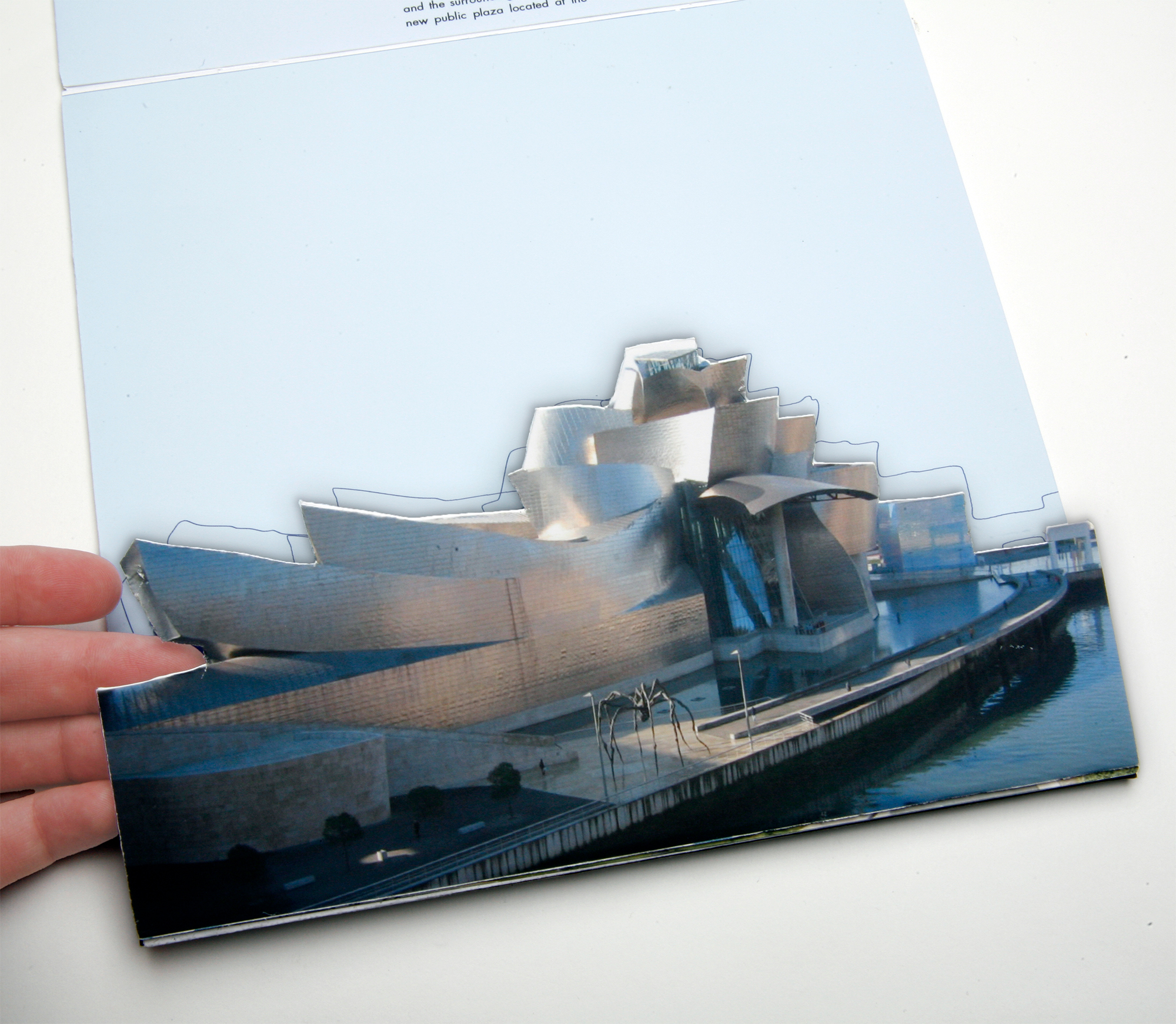
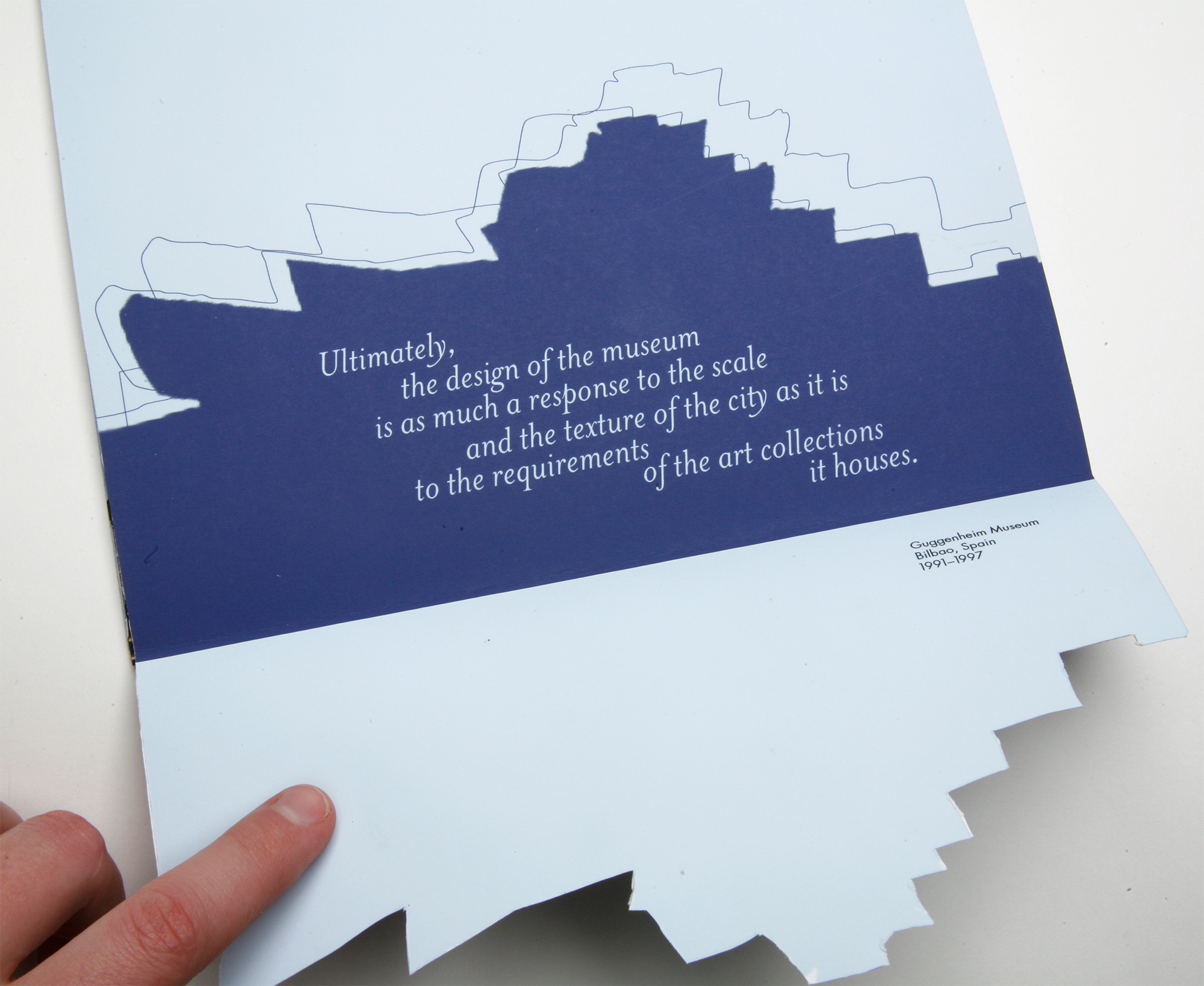
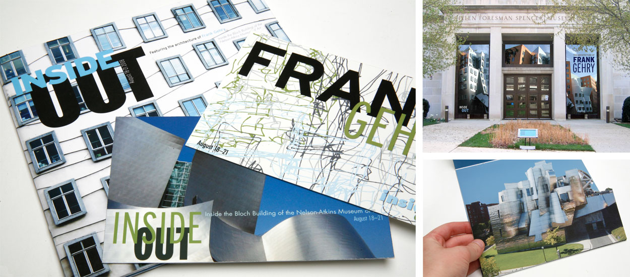
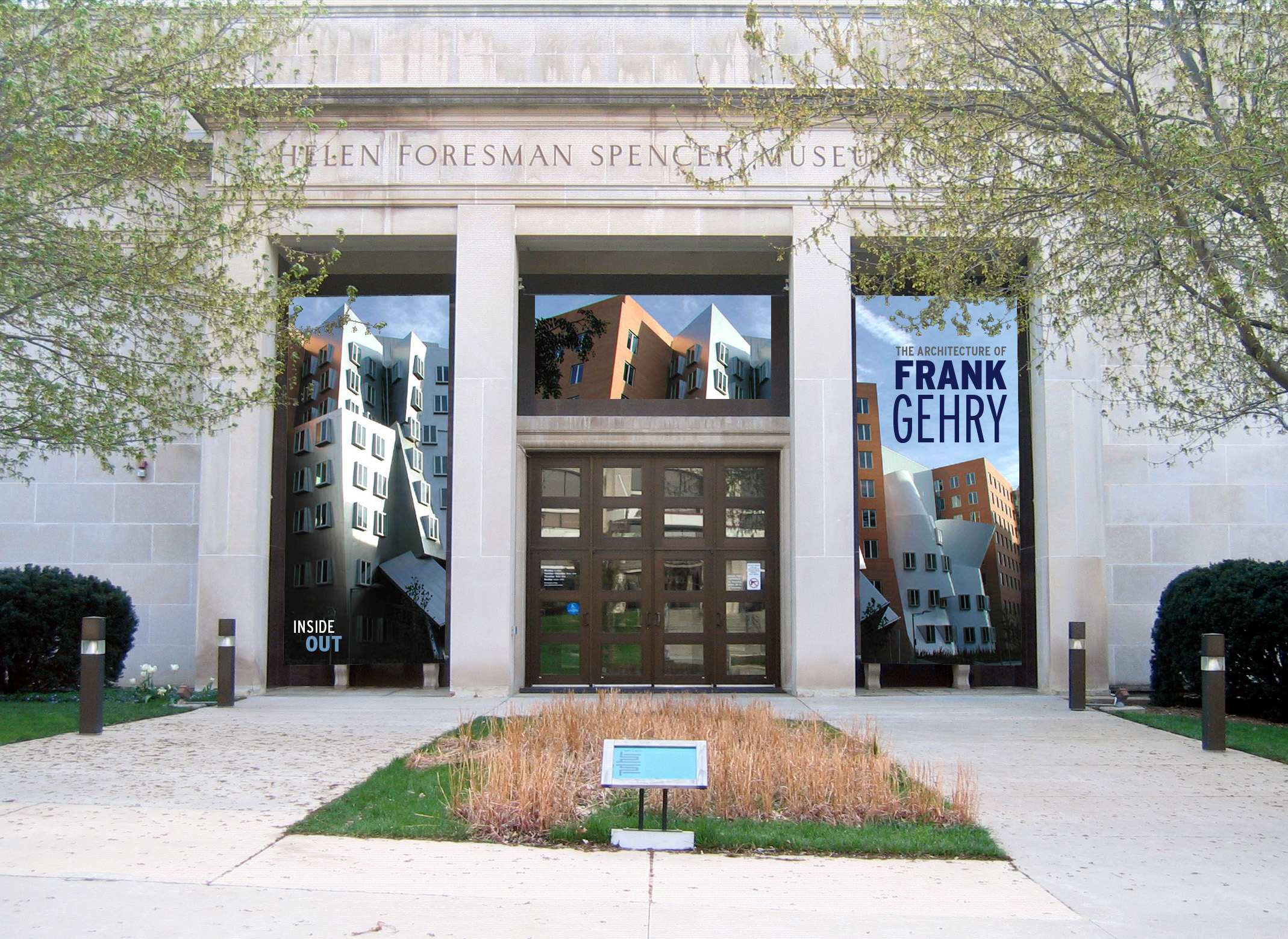
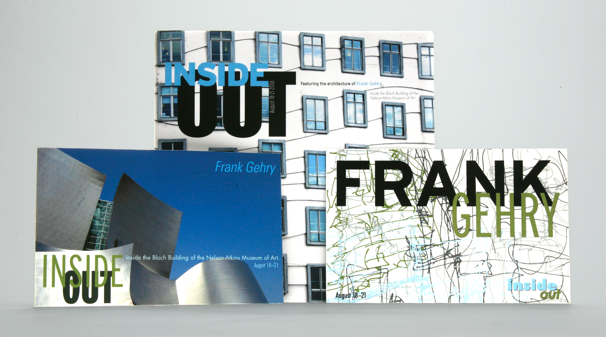
For this museum exhibition celebrating the architecture of Frank Gehry, I aimed to mirror the dynamic lines and fluid forms seen in his iconic designs. By incorporating scanned sketches from Gehry himself, I brought an authentic, artistic touch to the project. The exhibition collateral, from brochures to exhibition signage, reflects Gehry’s architectural essence through graphic elements that emphasize movement, structure, and flow. The typography was chosen to complement these design principles, adding both clarity and modernity while allowing the architecture to remain the visual focus.
Client
The University of Kansas
Date
2011
Category
Branding / Identity, Print Collateral
Share
Privacy Settings
We use cookies to enhance your experience while using our website. If you are using our Services via a browser you can restrict, block or remove cookies through your web browser settings. We also use content and scripts from third parties that may use tracking technologies. You can selectively provide your consent below to allow such third party embeds. For complete information about the cookies we use, data we collect and how we process them, please check our Privacy Policy
Youtube
Consent to display content from - Youtube
Vimeo
Consent to display content from - Vimeo
Google Maps
Consent to display content from - Google