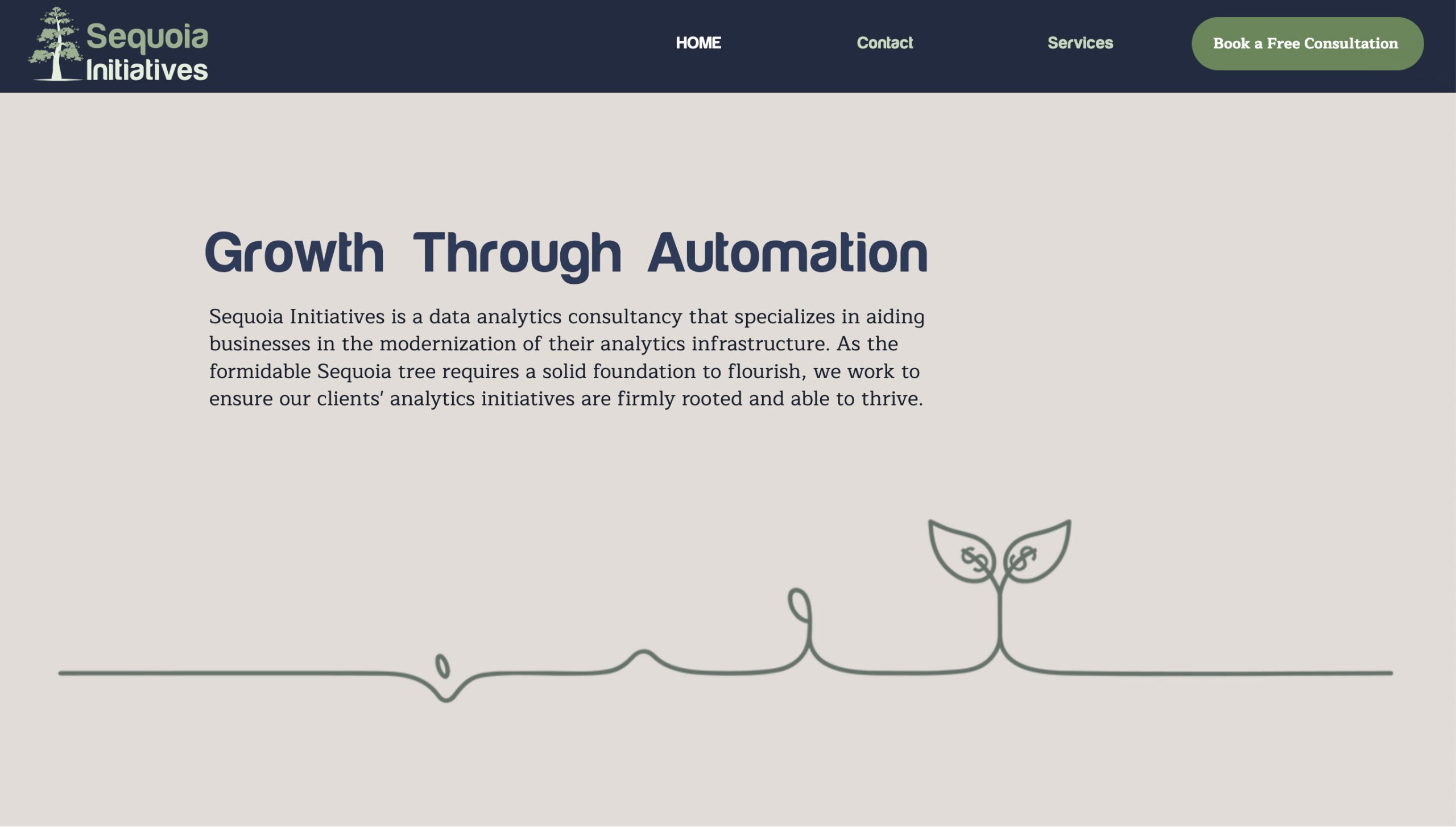
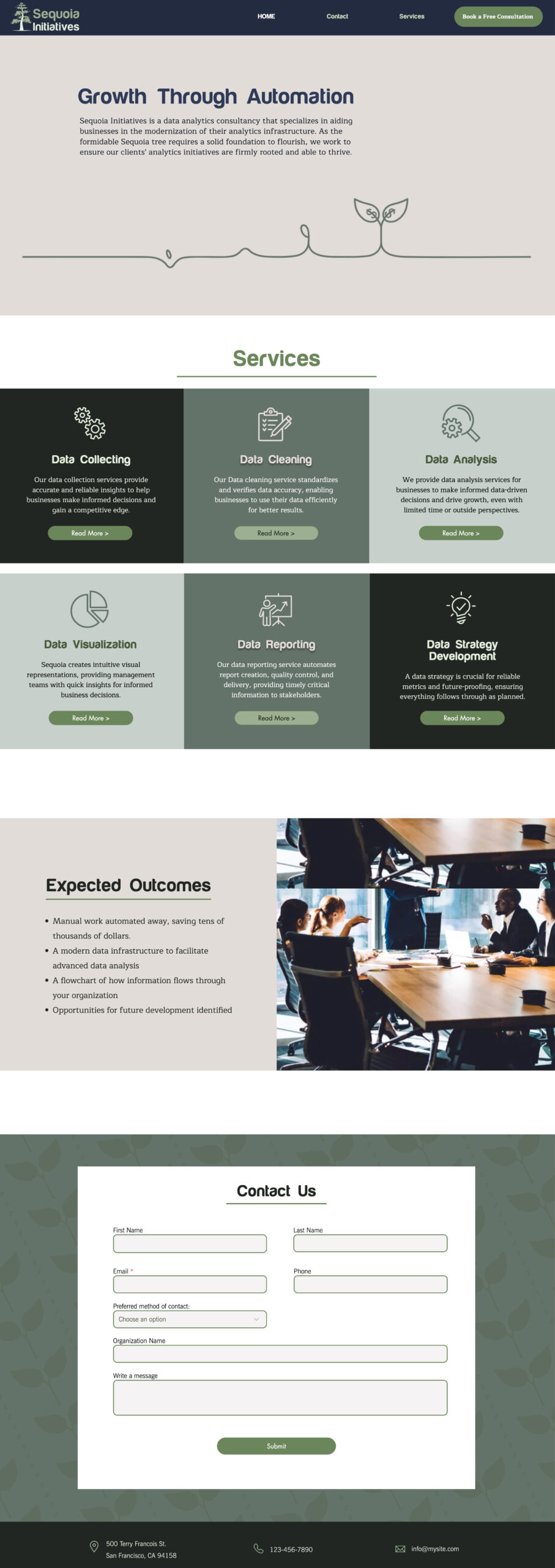
The website for Sequoia Initiatives embodies a clean, professional design aligning with the company’s focus on data analytics and consultancy services. Per the client’s request, we used a darker, muted color palette to create a staid & sophisticated aesthetic, which evokes trust and stability. The typography blends serif fonts for authority and sans-serif for readability, while simple icons and minimal line art reinforce the brand’s modern yet grounded identity. The site’s card-based layout effectively presents services, with clear calls to action and a well-organized contact form. Overall, this design ensures a user-friendly experience with easy navigation, concise information delivery, and a polished, professional look, tone, & feel.
Design Summary:
- Color Palette: The use of muted greens, dark shades, and beige gives the website a natural, grounded feel, suitable for a company focusing on data strategy and growth. Per the client’s request for a subtle and muted palette, these colors were used to evoke trust, professionalism, and a sense of stability, aligning with the company’s mission and branding.
- Typography: A mix of serif and sans-serif fonts creates a balance between authority and readability.
- Visual Elements: Minimal line illustrations and simple icons contribute to a modern, clean look without overwhelming the user.
- Usability: The overall design promotes easy navigation, quick access to information, and simple user engagement with clear CTAs.
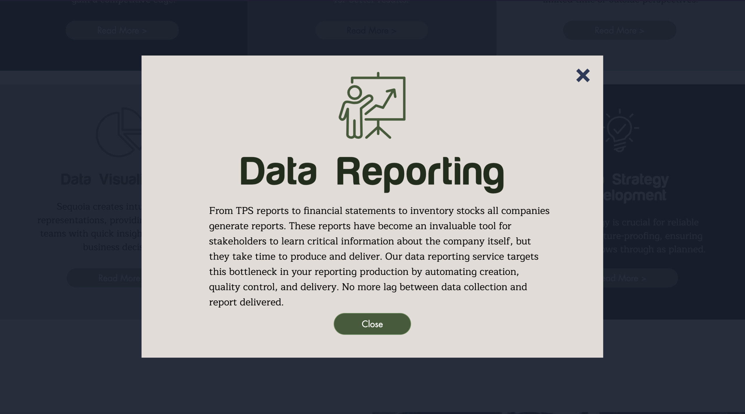
Expanded Card Views:



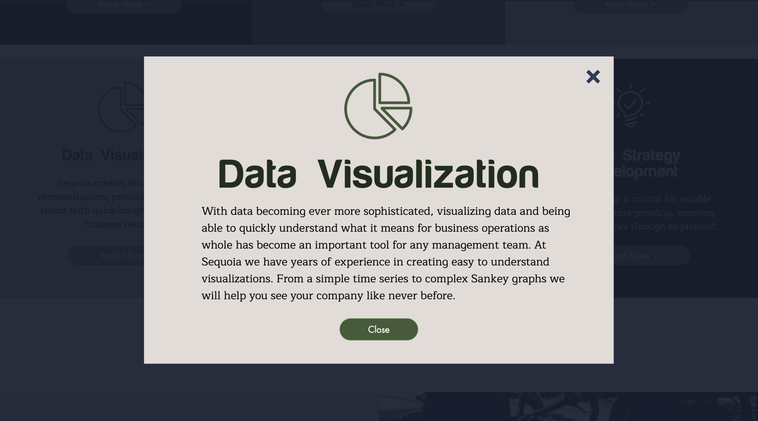
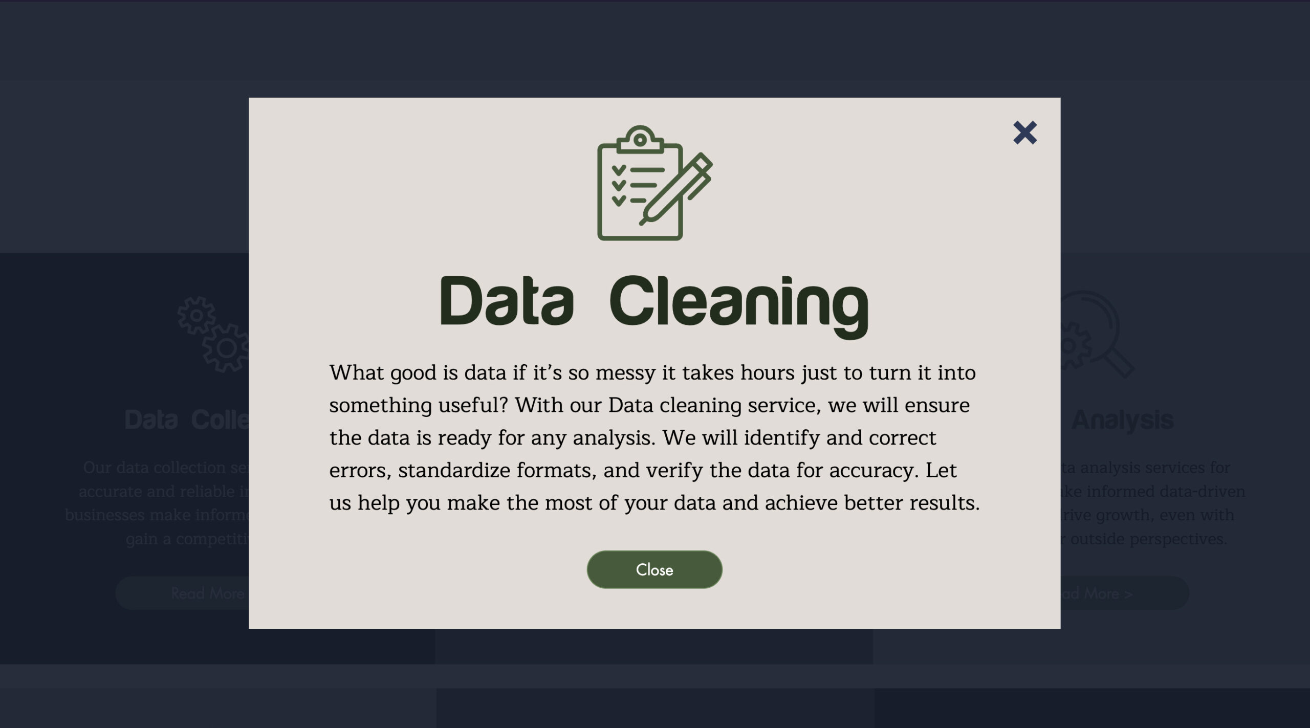
 ️
️